Back
BackRole
Design Lead
Primary Collaborators
Adam Slotnick - Chief Product Officer
David Wu - Chief Executive Officer
Years
2019-2021
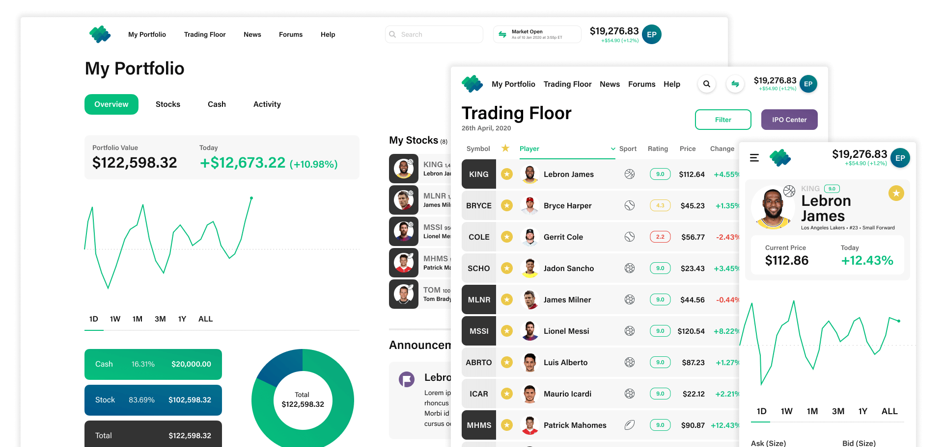
The Problem - We needed to create an area that acts as a homepage for the user and summarizes the current state of their account. This needs to include access to their stock and cash holdings as well as an activity summary.
For this area I went straight to working with low-fi mockups that had minimal colors and some details so I could go back and forth with Adam easily while we sorted out the product needs and general look and feel. This made the feedback loop simpler as we combed through the areas on these screens. I then took those comps and made our pixel perfect designs working with the design system to be sent off to developers.
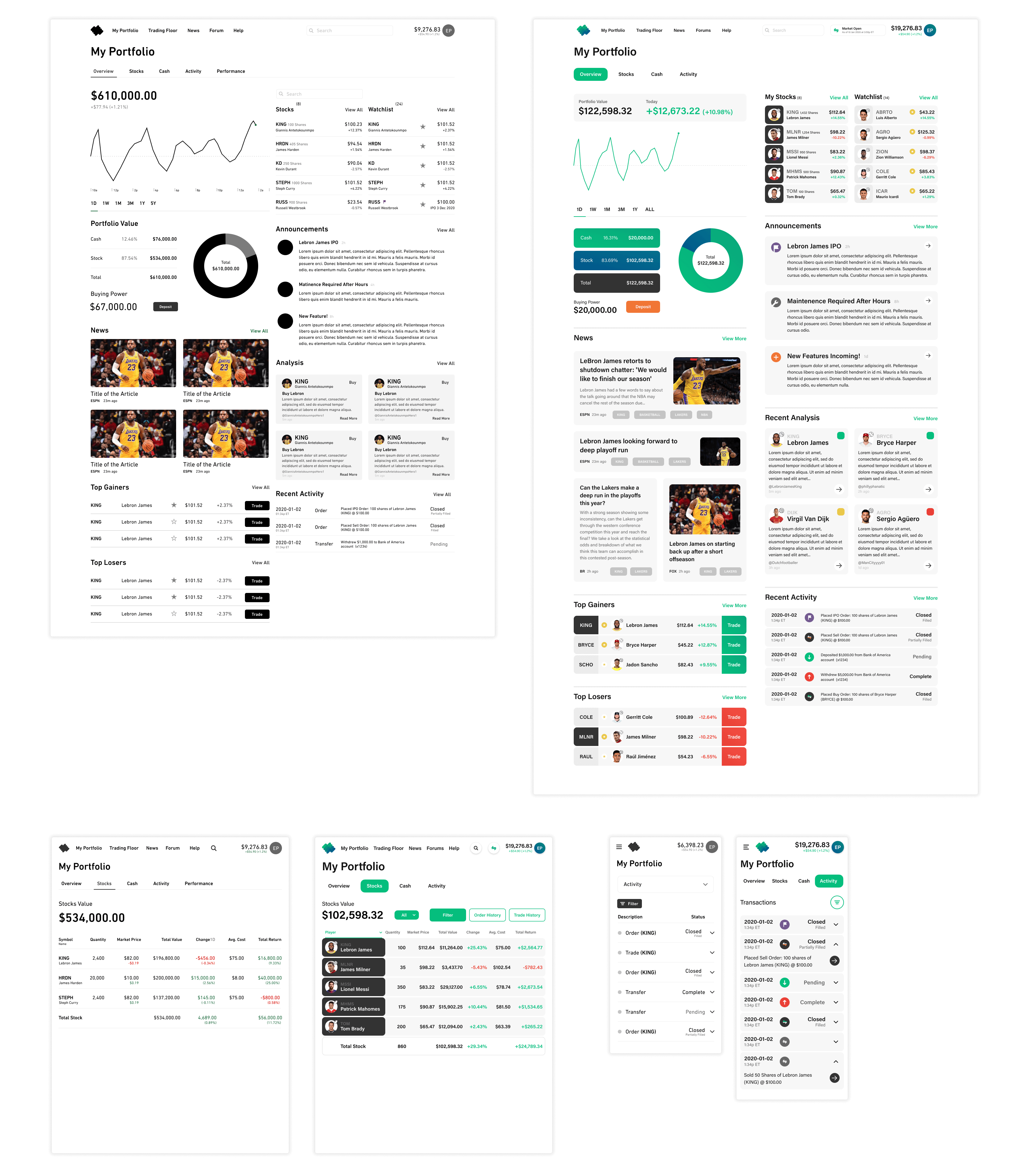
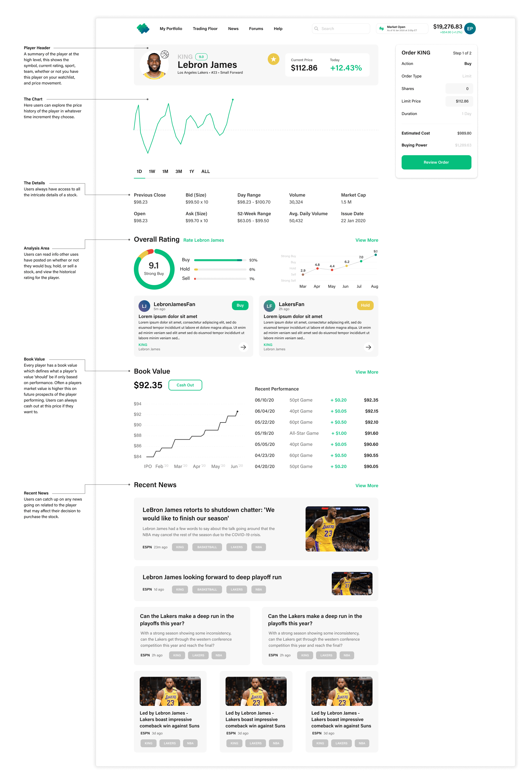
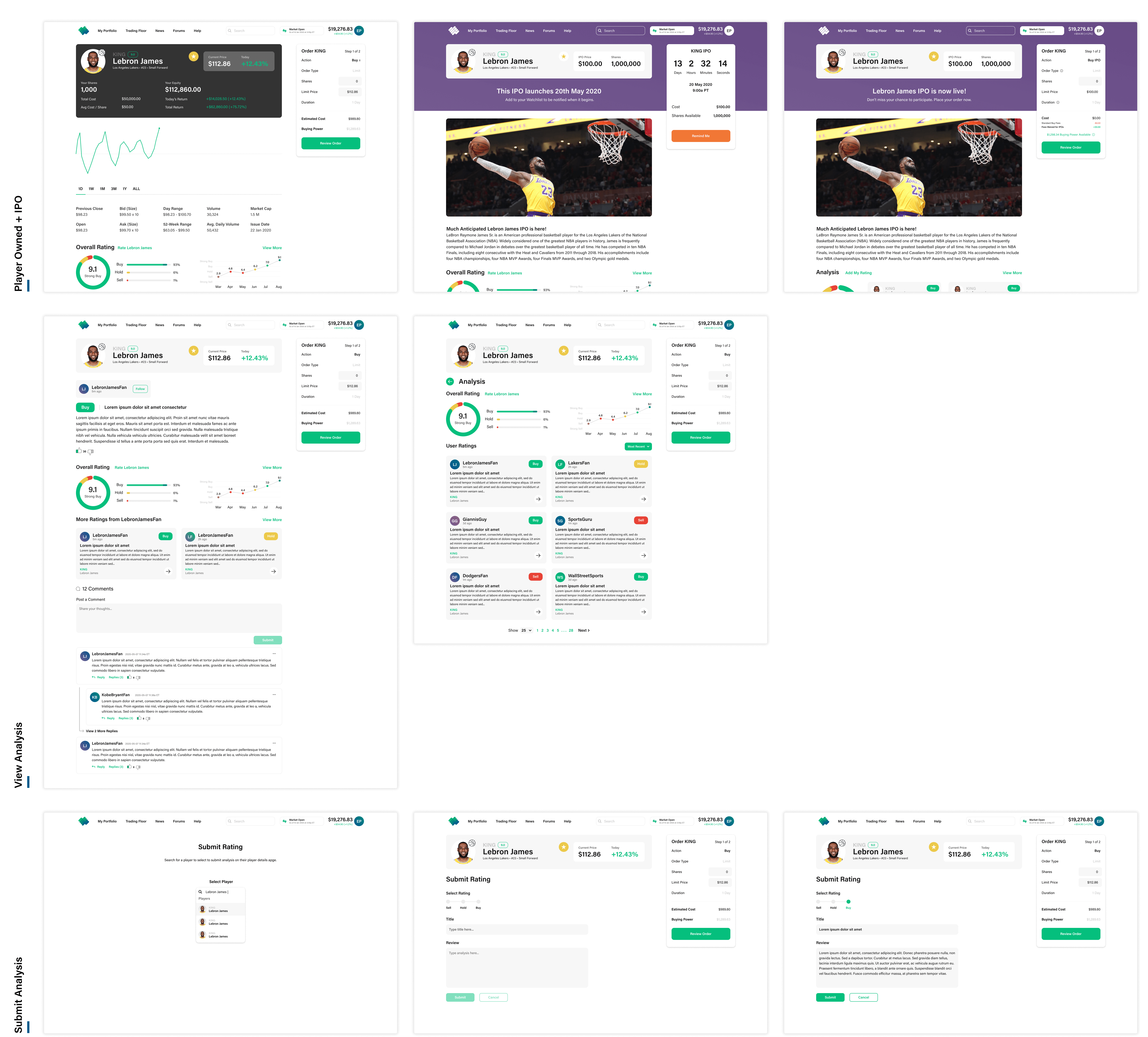
The Problem - There needs to be a player specific page that showcases anything a user would want to know about a player including their current price, past performances, analysis, and recent news. This will also be where uses are sent through the trade flow to actually purchases shares of the player to invest in.
For this page I took some of the ideas that had been developed on the portfolio page and fleshed them out a bit more here to be catered to individual players. Since the action of actually executing a trade was in some ways the most important part of this page - the trade module exists on it's own rail ready for the user to interact with it at any time (more on that experience later).

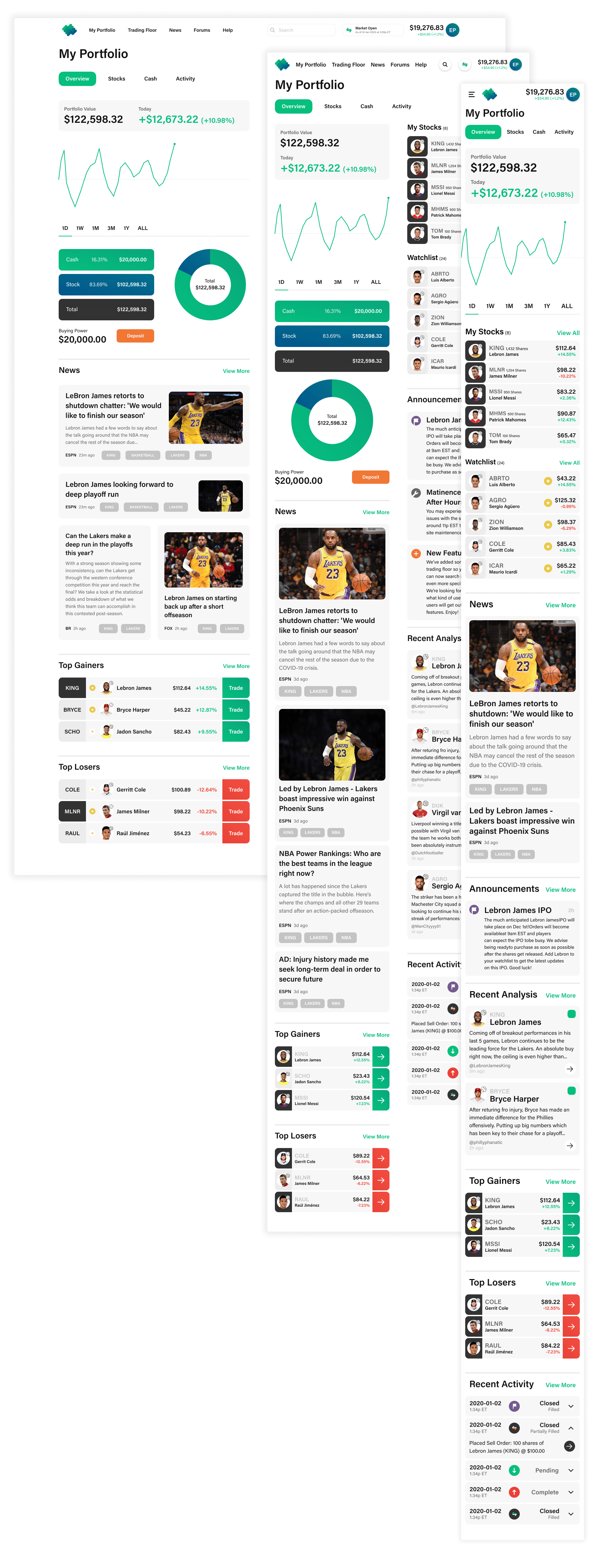
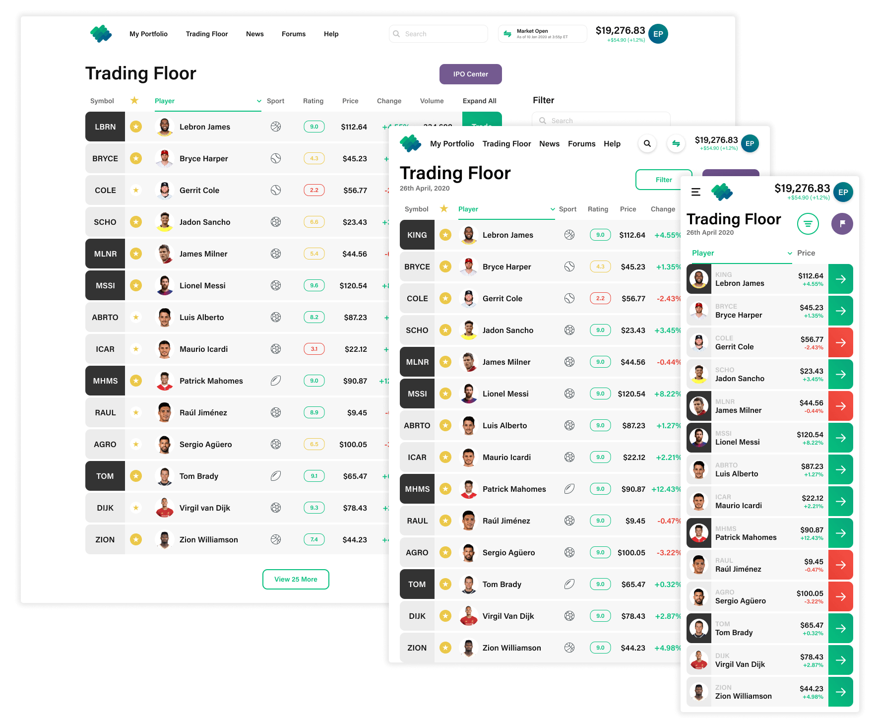
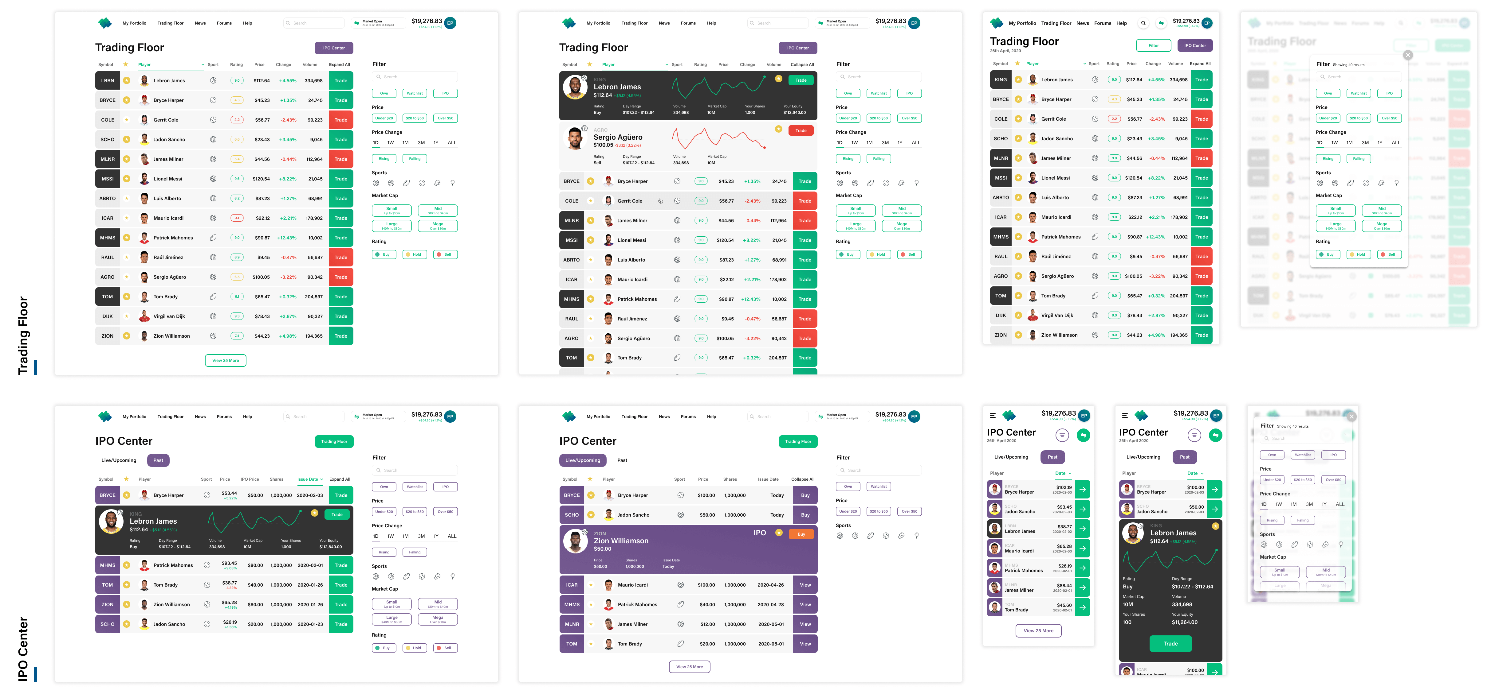
The Problem - An integral part of the site - we need to have a trading floor area where users can see the market alive. This area needs to list all the players in the market and allow users to filter through what they want to see. It also needs to be in motion while the market is open - where prices are changing and details are being updated in real-time.
To successfully satisfy this requirement I created a trading floor that was clean and showed details clearly, but was still easily sortable and expandable in a way where users could further explore without leaving the page.

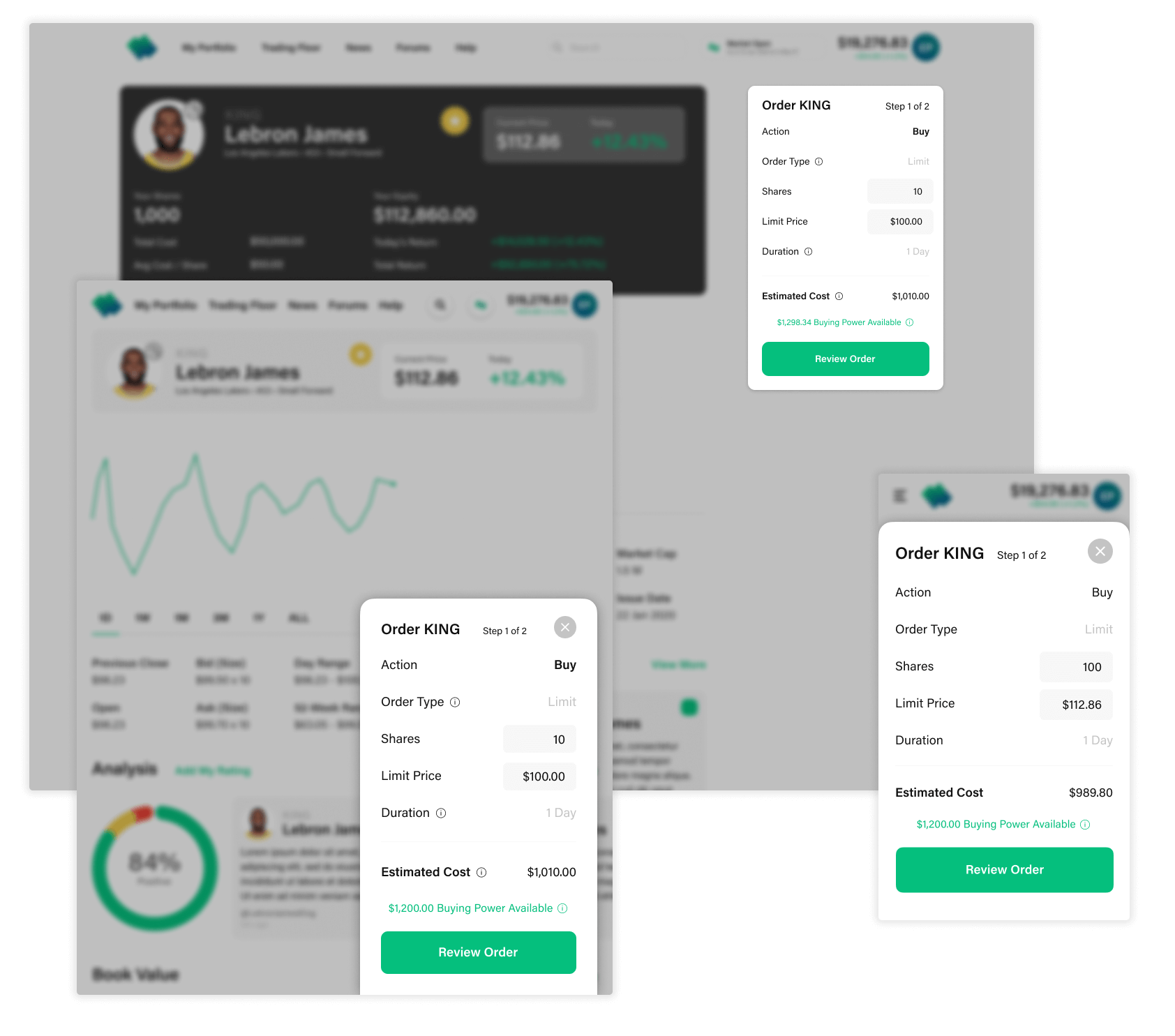
The Problem - Arguably one of the most important parts of the product, users need to be able to easily buy and sell shares of players on our market.
I resolved to putting this experience inside a module to keep it consistent whether or not a user was on desktop or mobile. Given only the inputs required and the small nature of the design, I immediately started iterating on high fidelity mockups.
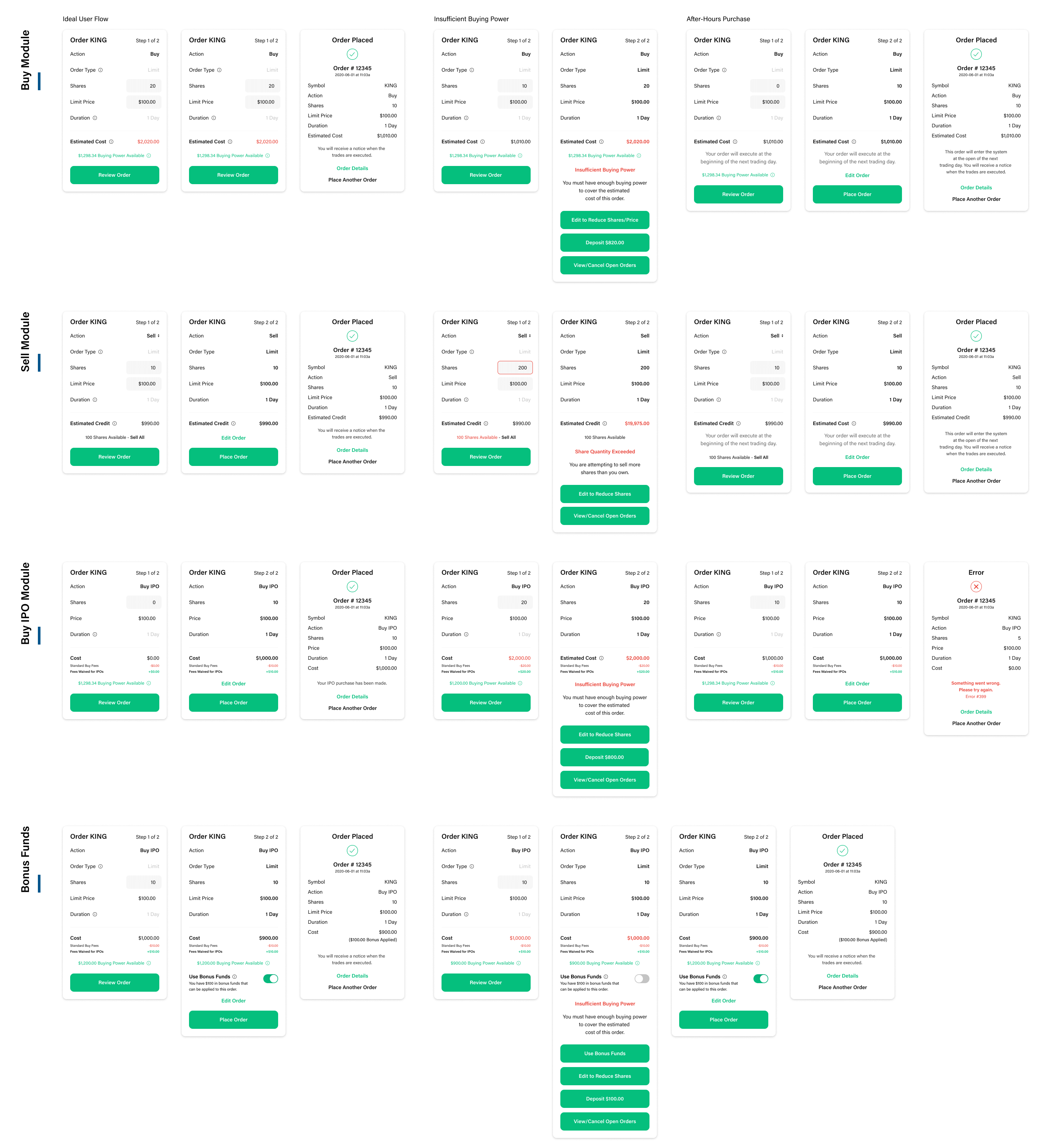
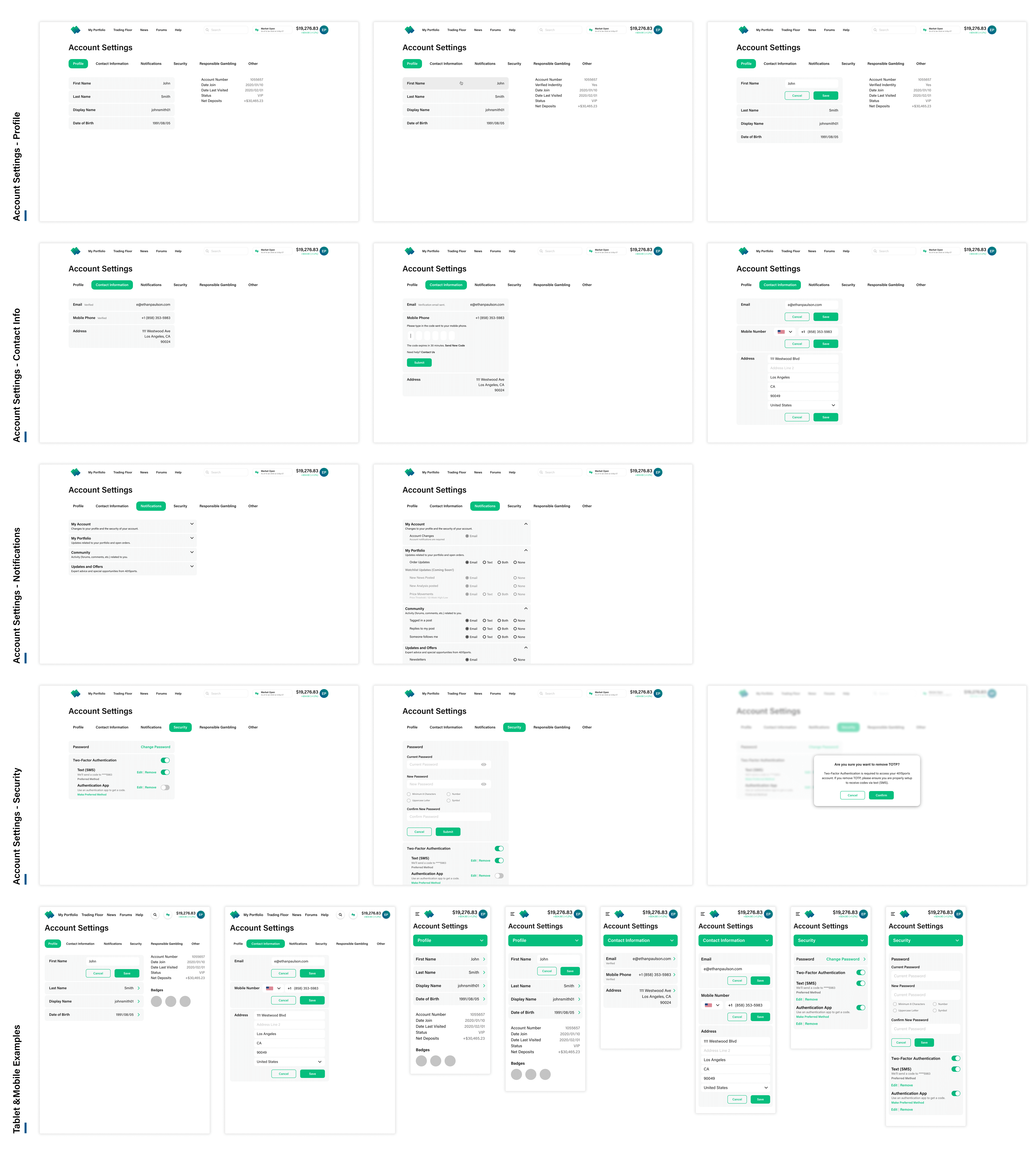
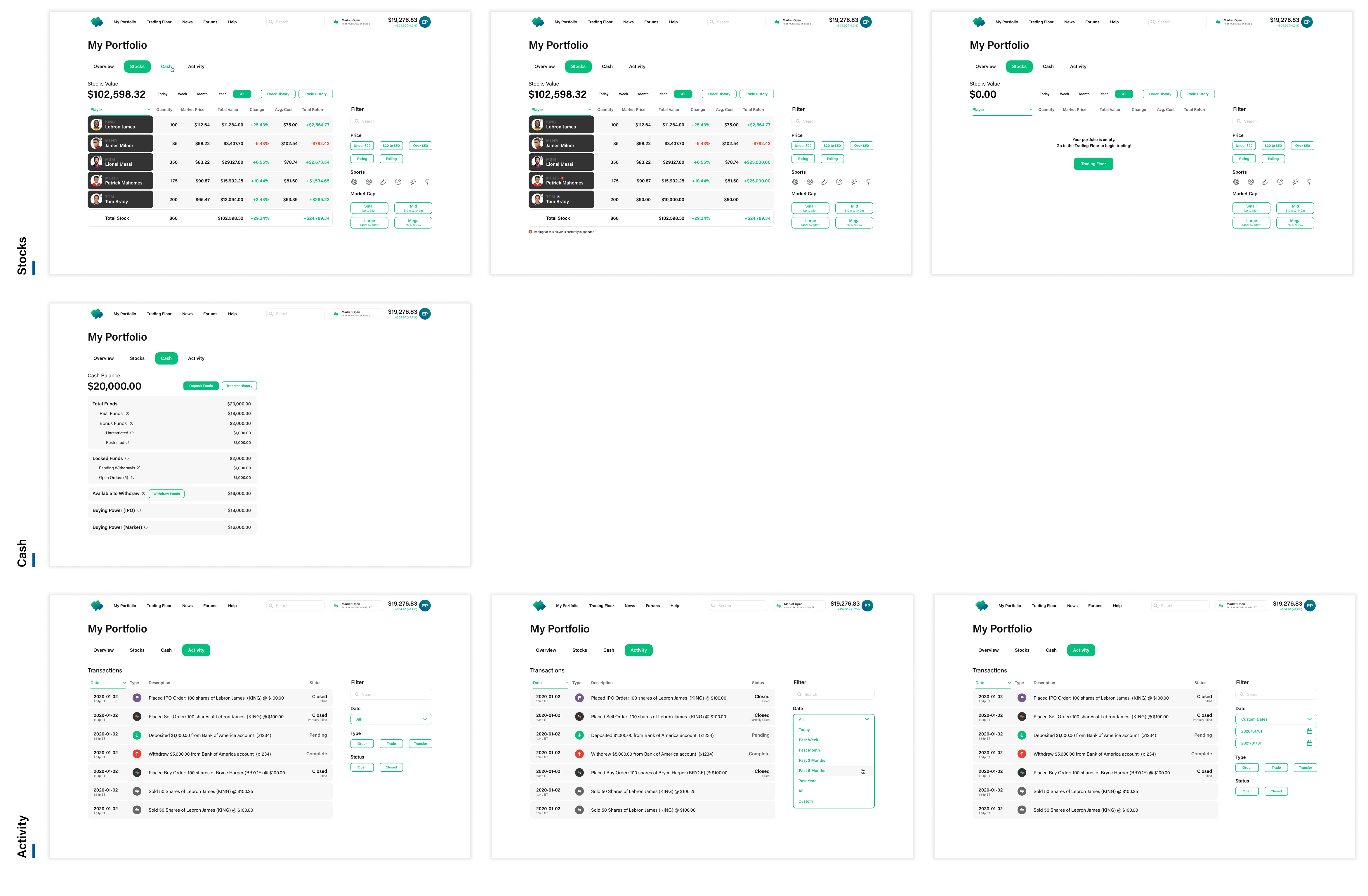
The Problem - In order to comply with gambling license standards, we had to give users robust access to all their history on our platform. Our product document just had a list of items required on this list to satisfy the license.
Users can see a detailed record of all their actions on the site and all the technical specifics on any trade they’ve done. Given just a list of requirements and the different states an order could be in, I had to visually organize each of these different scenarios.

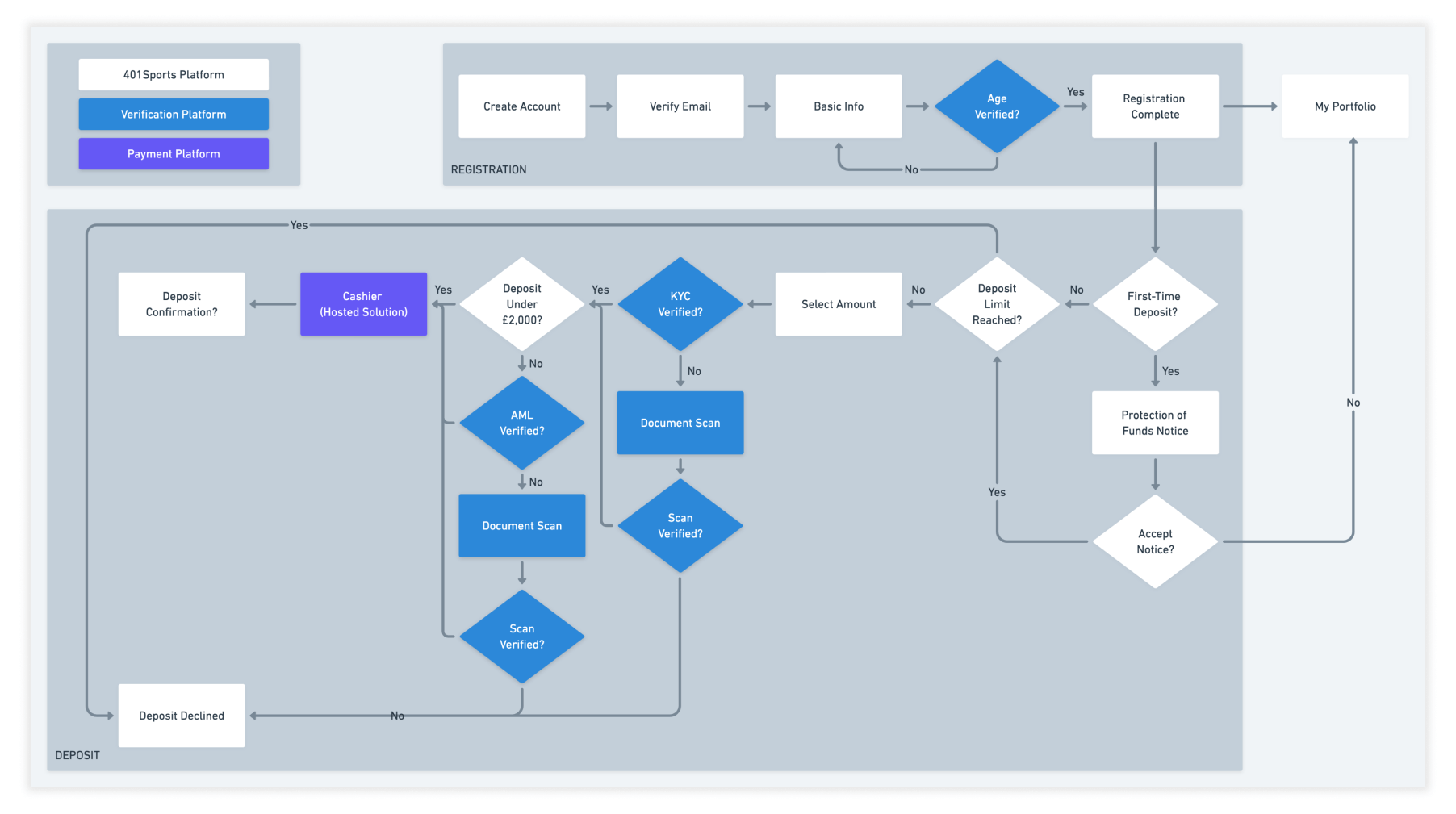
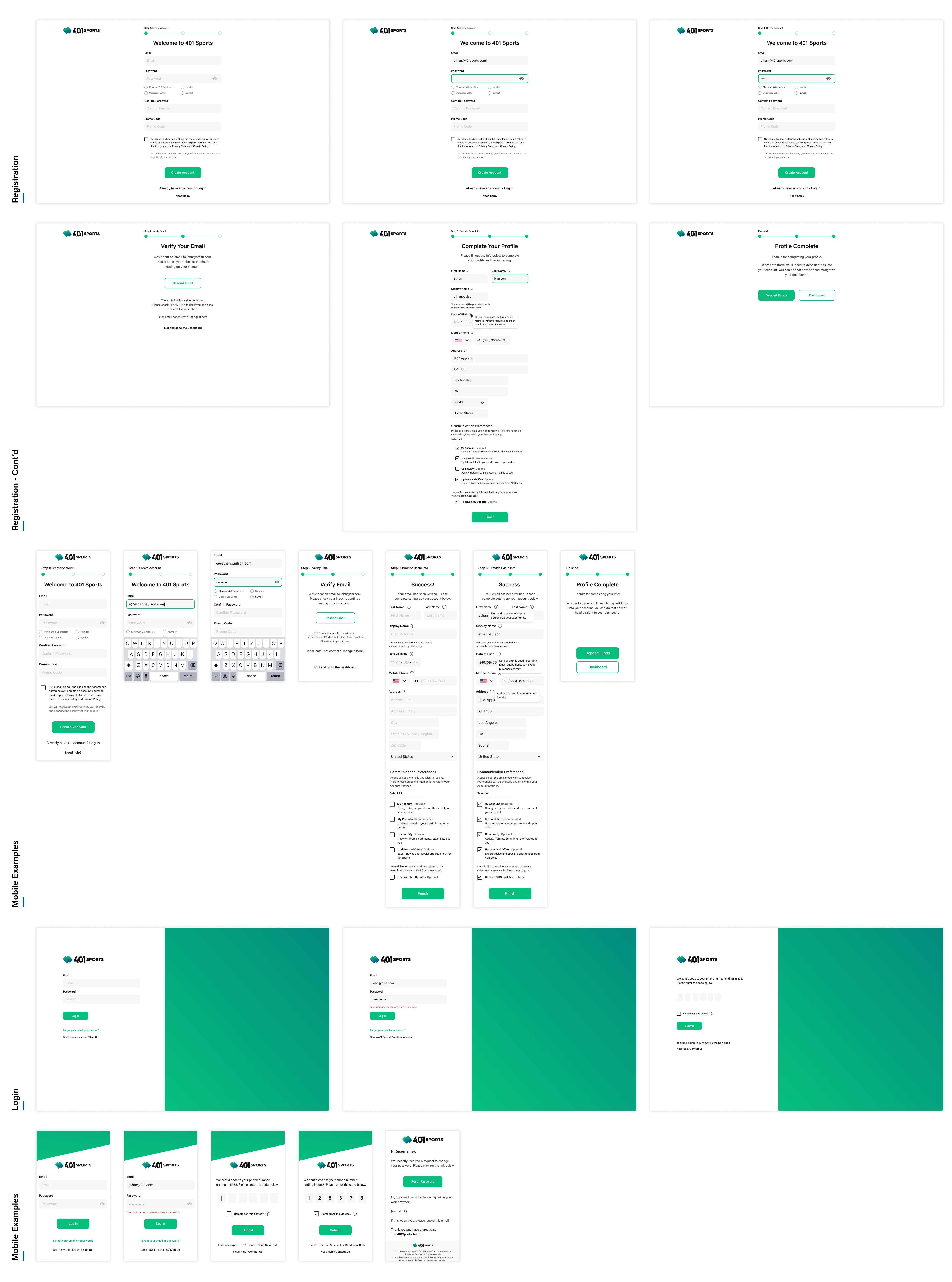
The Problem - Given that we're a fantasy sports site, we have to ask for a few more things from the users in order to sign up. We have to make this a smooth experience despite the added work needed for a user to create an account.
To begin, Adam and I made a user flow chart to make sure we had each of the possible branches a user could go on covered in the screens. I used that as a directive when designing the pages to make sure I covered each scenario.