 Back
BackRole
UI, Motion Design
Primary Collaborators
David Wertheimer - President, Digital
Jon Dean - SVP, Design
Clark Pierce - SVP, TVE
David Feldstein Du - VP, Product
Year
2019
The Ask - Build out a data-driven bonus feed for NFL & College Football available to digial users that wraps the game inside rotating statistics that relate to the gameplay.
In order to meet this ask, we had to build an experience complete with what kind of data we should be showcasing along with how we would present it visually. This created a tall ask to come up with not only what kind of data viewers wanted to see, but how we can make this data clear, effective, and interesting. I collaborated with Jon, David, and Clark to come up with the many different data visuals we could use for the product and create a feedback loop for the designs..
You can check out a full demo of the product above. All data curation, design, and animation were done by myself in After Effects.

How do we guide another narrative with our data?
What stories aren’t obvious in the game that can be presented through statistics?
Are there any constraints with the data we get?
How can we make sure it looks like a professional broadcast level product?
These questions and more kicked off what would be one of my favorite products for FOX to date - allowing me to embrace my love for sports and integrate that knowledge with design to create a product that sports fans would appreciate.
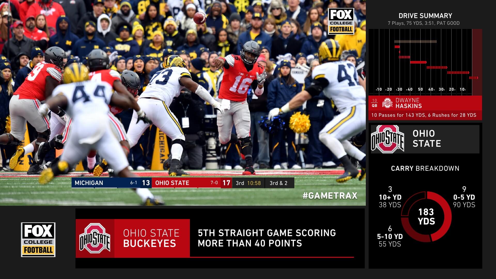
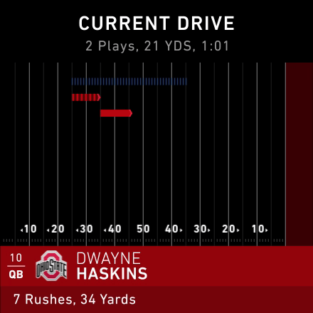
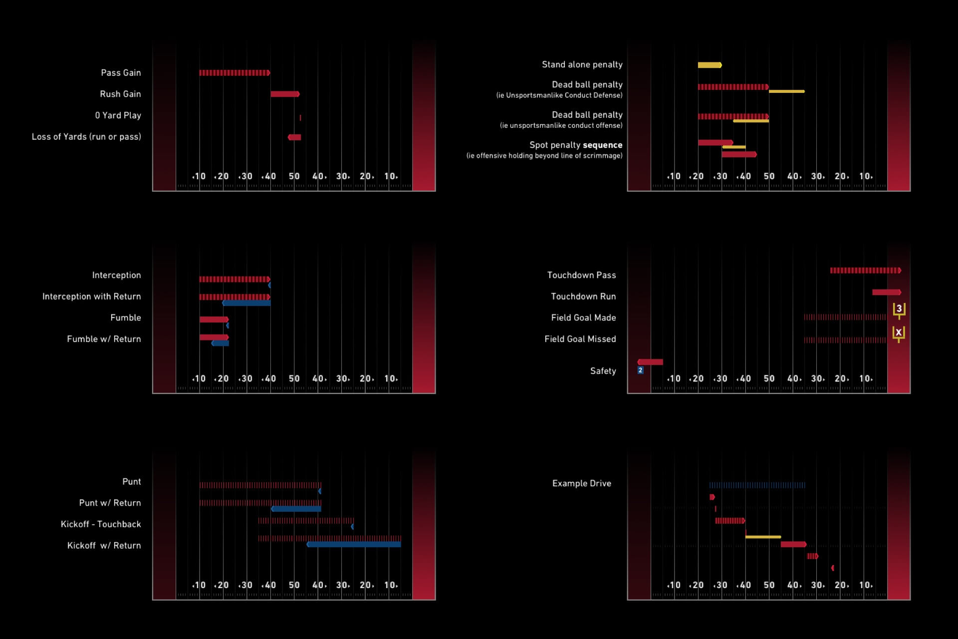
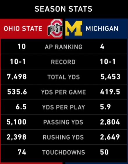
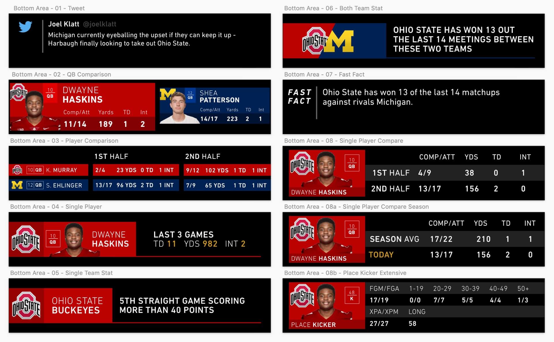
We had three main sections to work with, a top right section that would remain a constant drive chart with ball movement and a player involved with the last offensive play, a right rail used to display data and a bottom section used to display data.
Defining how we displayed drive data was a task in itself as I needed to give a clear and defined pixel by pixel guide to the creative developer who would be building this out within our broadcast platform and making it dynamic to work with our data feeds. Quite a few things can happen on a particular play, so I had to flush out how all of those instances would look visually - runs, passes, no yard gains, losses, penalties for positive yards after a play or replacing the play, penalties for negative yards, etc.
I decided the right rail in its vertical format could be used well for team stats. Total yards, total first downs, total plays, team statistics for the game/season, top rushing, passing, etc all coming into play here. This was another area to build interesting narratives such as ‘stats since this time’ ie - ‘average yards per play in the second half’ - which can tell interesting stories in and of themselves if a team came out of the locker room struggling or thriving.
In the demo we see a great example of this - Ohio State was averaging just 13 yards per drive in the first half, but had since averaged 52 yards per drive in the second half. A huge offensive turn for them.
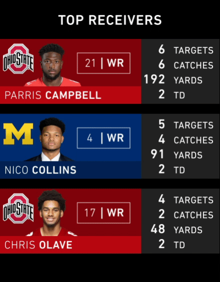

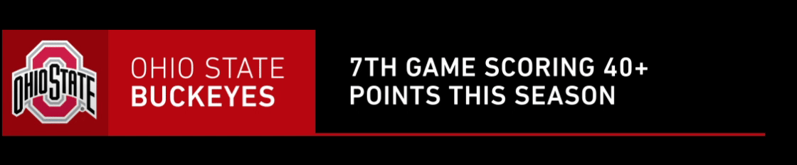
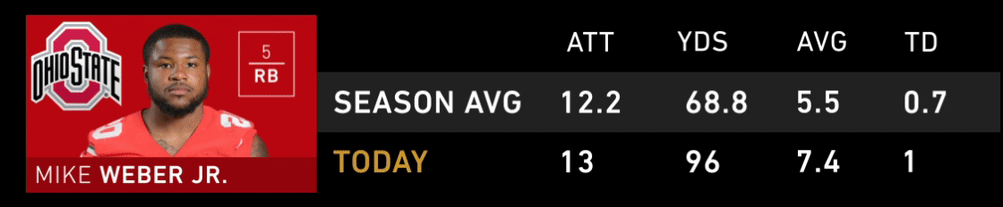
For the bottom area being a large horizontal space, I felt this could be utilized well for written facts about the game that the producer could create on the spot, as well as stat comparisons between players and more in depth stats on a particular player’s performance. We could also have a social aspect here - grabbing tweets from our personalities and displaying those as well. These formats introduce many different options that the producer can utilize while the game is going on.
The Requirement - In order to build a successful product, we needed to interview sports fans that often stream games to see what exactly they'd like to see in an experience like this.
Some questions we asked were:
What kind of data about the game would you like to see?
Are there particular stats that you keep a close eye on as you watch a football game?
Would you like to see game outcome odds in real-time?
If you had access to all the sports data in the world, what would you try to find and show?
Some of our interviewee's answers that went directly into the product were real-time drive summaries, head to head data, and providing arbitrary facts that otherwise wouldn't be talked about on the broadcast. We also deduced from interviews that with this being a data specific feed - we could get as exact as we wanted with the data we presented since users would appreciate whatever interesting insights we had to offer.
-
Seeing this come to life as I was watching games was my favorite part - a truly in depth data experience that didn’t interrupt the experience of watching a game but complemented it in the best way possible. The great thing about building this was knowing I was essentially creating the experience for myself - someone who enjoys the story running alongside the game.
Role
Brand Design
Primary Collaborators
Jon Dean - SVP, Design
Soo-young Lee, UX Designer
Year
2016
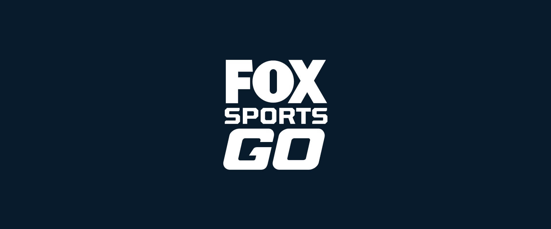
The Ask - We needed to update the current FOX Sports GO Logo to have a more modern look and feel for the app's redesign.
One of my first projects at FOX was recreating our FOX Sports GO app logo. The old logo was outdated, didn’t fit well in small placements, and didn’t fit our current product visuals. With FOX’s regional sports networks utilizing the logotype for TV, on-field use, and digital and print marketing we needed a simple yet effective brand mark that could fit in many different environments.
Since the FOX Sports aspect was locked in based on our logo work for that, it was really the GO that needed to be crafted originally.
I collaborated with Jon who assigned the task and worked with me through the many iterations and development of the logo, and Soo-young Lee was responsible for refining some of the motion I created with the logo and the presentations we used to show the process.
After a few dozen versions of GO, I settled on the logotype you see below.
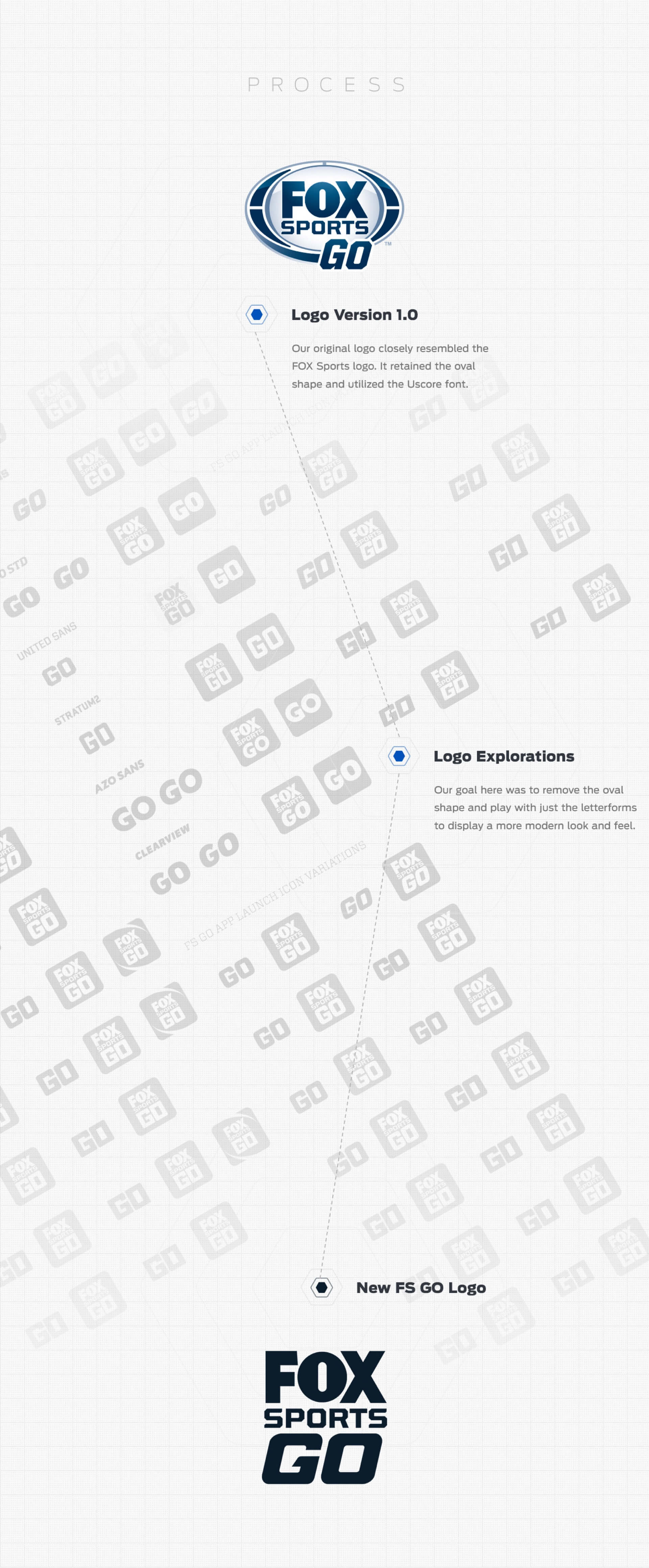
This app icon and logo can be seen in lots of different types of media, and we were happy to have a new simple yet bold brand direction to steer people towards the app to consume our content on it.
Role
Design, Development
Primary Collaborators
Jon Dean - SVP, Design
Faye Xu, Art Director
Nick Perdomo, Front End Designer
Year
2019
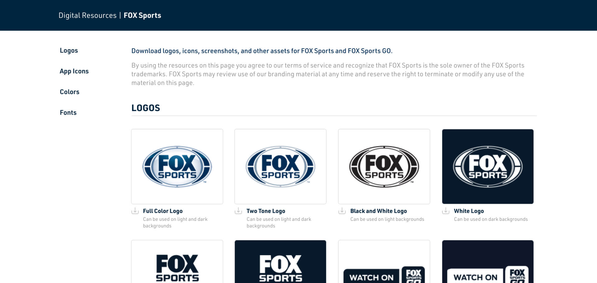
The Problem - At FOX we had a bit of an inconvenient issue - there wasn’t a central place to grab logos, icons, screenshots, brand colors or anything else you may need on a semi-regular basis. We would get emails all the time asking for a single logo, what our color profile was for a certain app, can you send us this app icon or a screenshot of this app, etc.
I collaborated with Jon who advised me and gave feedback for the project, Faye who created the original interface of the site, and consulted with Nick on some of the ongoing development.
We thought of a solution - I’d build a simple html site to house assets and we could send that site out to people. It worked well - for a time.
But then we needed to update and add assets, and once people in other verticals saw the site they asked if I could build them their own.
The Problem - We needed a more robust way to update the stie with new items, and a better way to build other verticals their own site.
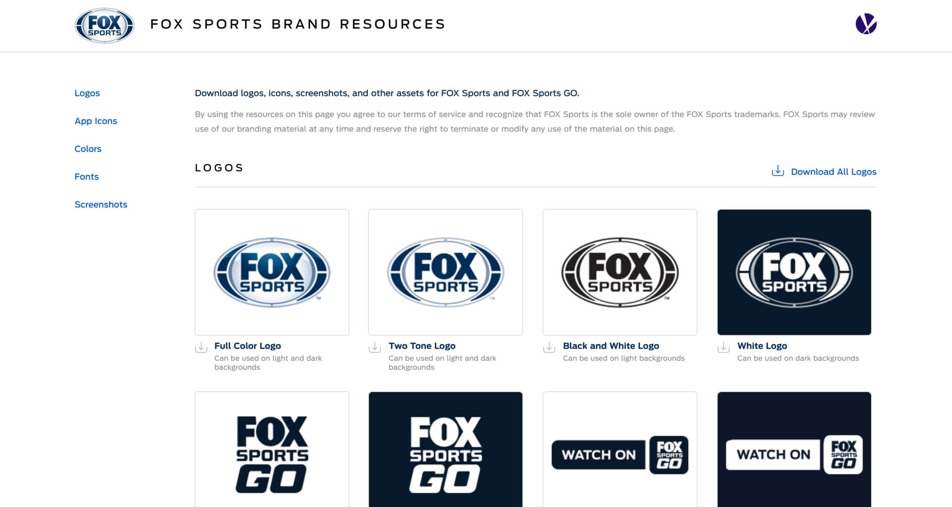
Thinking through how to solve this - I proposed that I’d build a custom wordpress site and theme that could handle all of the problems we were running into. With a Wordpress theme, a user could dynamically update any asset we wanted at any time without needing myself or another developer to do it.
The idea of this was very attractive to other departments at the company, and quickly they wanted their own sites too.
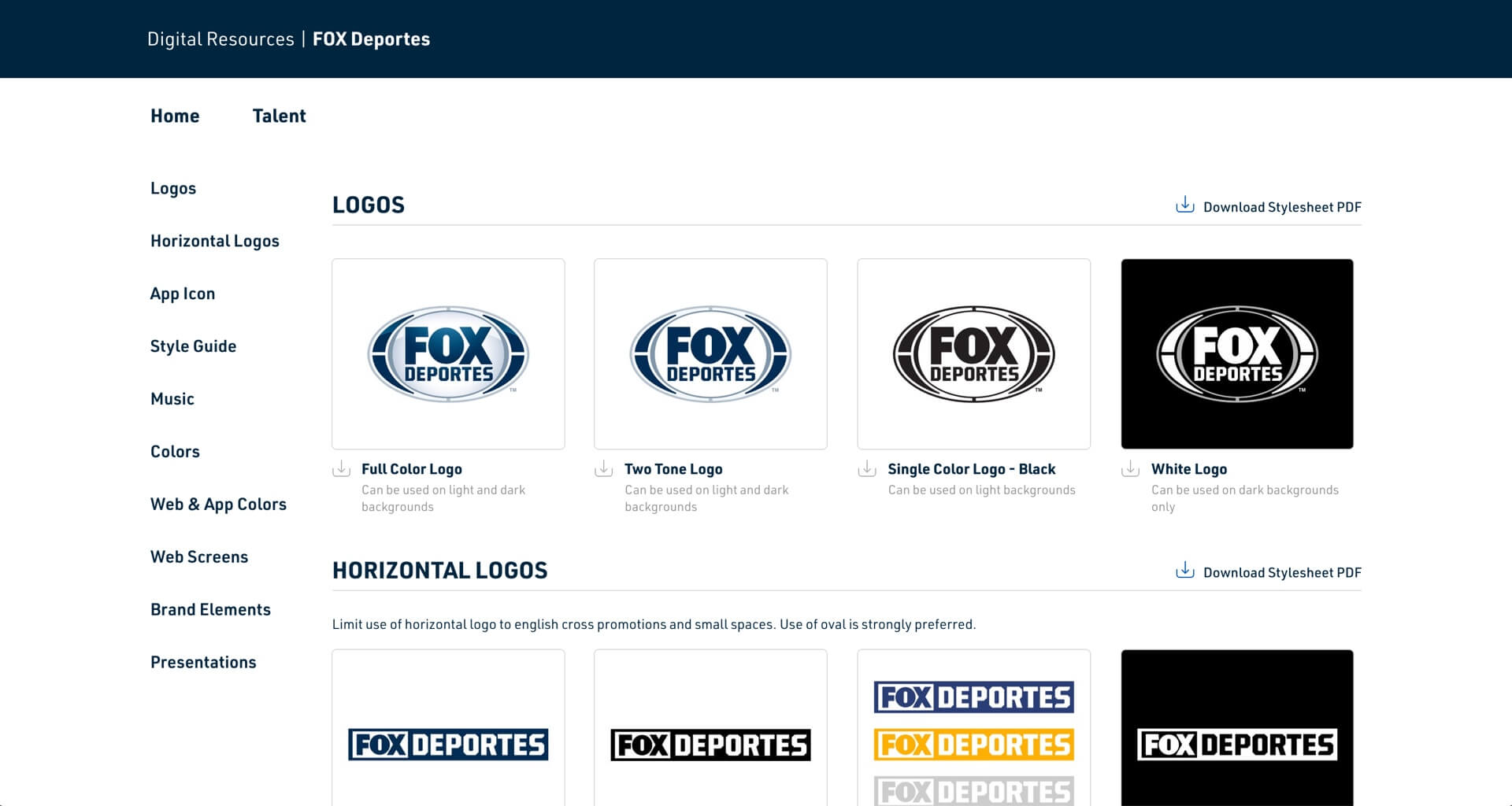
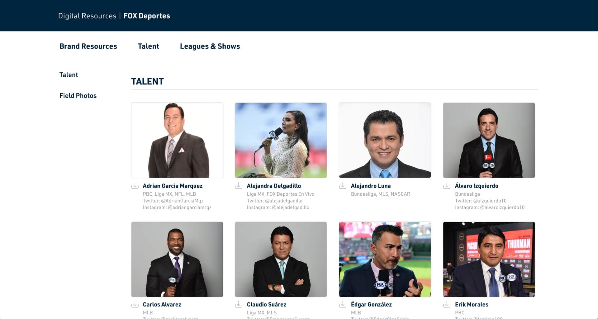
This is where the theme really showed off its robust nature. You could hand off the keys to people in those other verticals - so teams from NatGeo, FX, or FOX Deportes could just add assets themselves instead of putting in a request and having to wait.
The areas below show how users might add a logo asset or edit how their page looks.
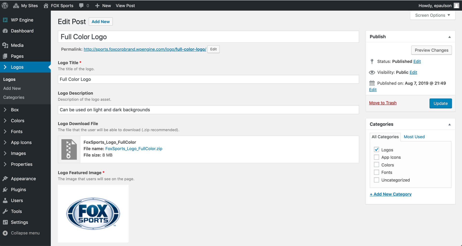
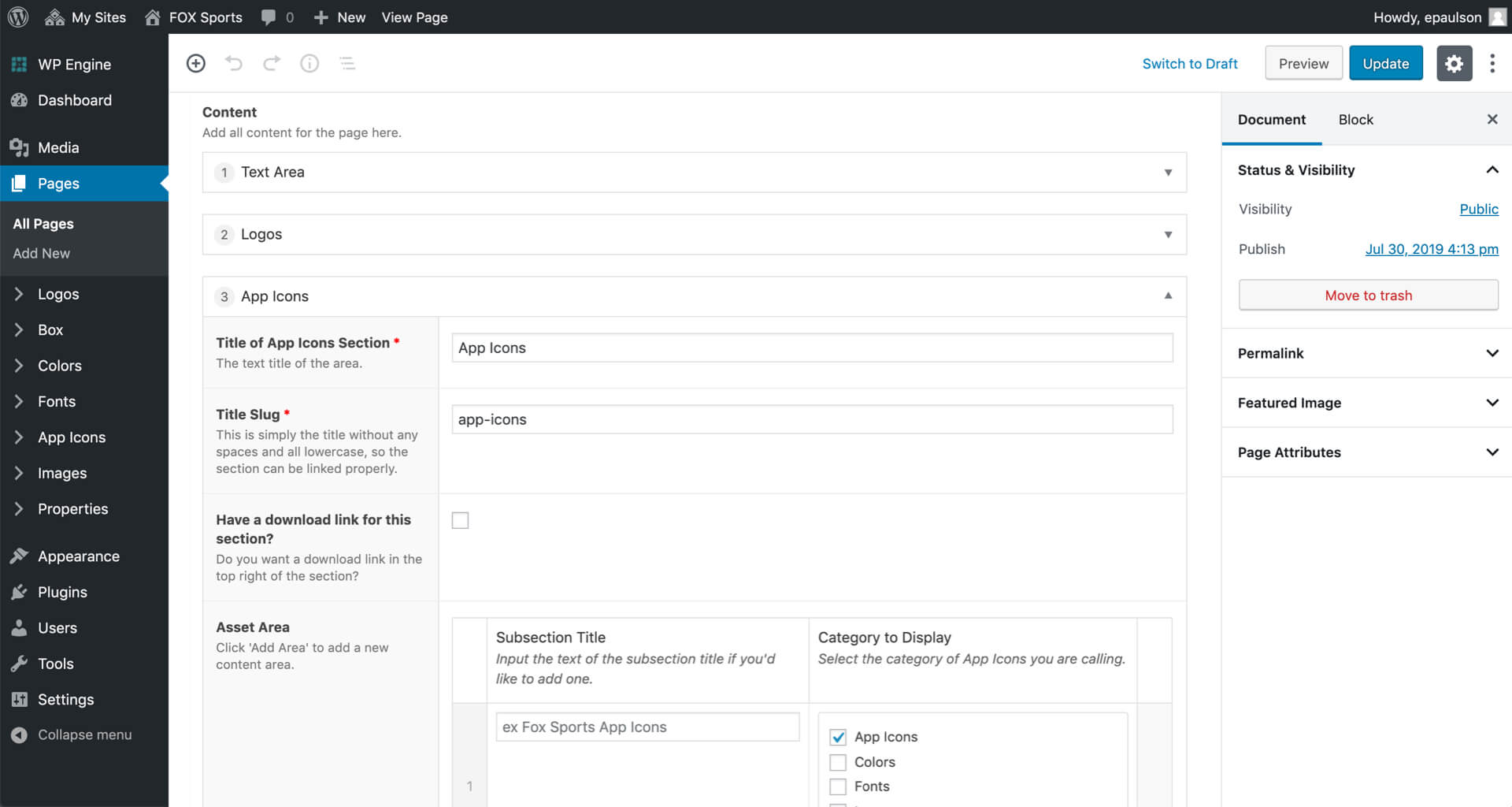
So, the Brand Resources theme was born out of that problem. I built the theme from scratch to fit our custom needs, and the site became a major internal and external tool across our properties.
After some testing from people that would be using the site, I was able to create a friendly experience for operators in their respective branches of the company to completely own their instance of the site.
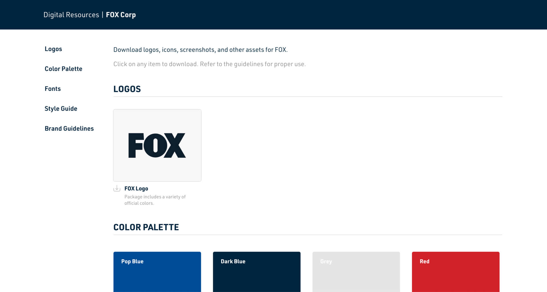
I’m proud of the journey of this site - a simple solution for a recurring problem transformed into a major tool for the company saving time for many teams.
And a tip of the hat to Jon, who not only allowed me to explore the much more time consuming solution, but also encouraged me to build it out and see it through to completion.
Role
Design, Motion
Primary Collaborators
Jon Dean - SVP, Design
David Feldstein, VP, Product
Elizabeth Wells, Marketing
Year
2018
For the World Cup in 2018, I was tasked with creating a sizzle video for our special in-app features that were launching for the event. Together with the product team, I created a video that would sit at the forefront of our app store in hopes to engage more users to download the app.
In testing, the version that had the video immediately playing at the front of the app store increased downloads by an incremental 8.2% - with a majority of users actively watching 85% of the video before deciding to take action.
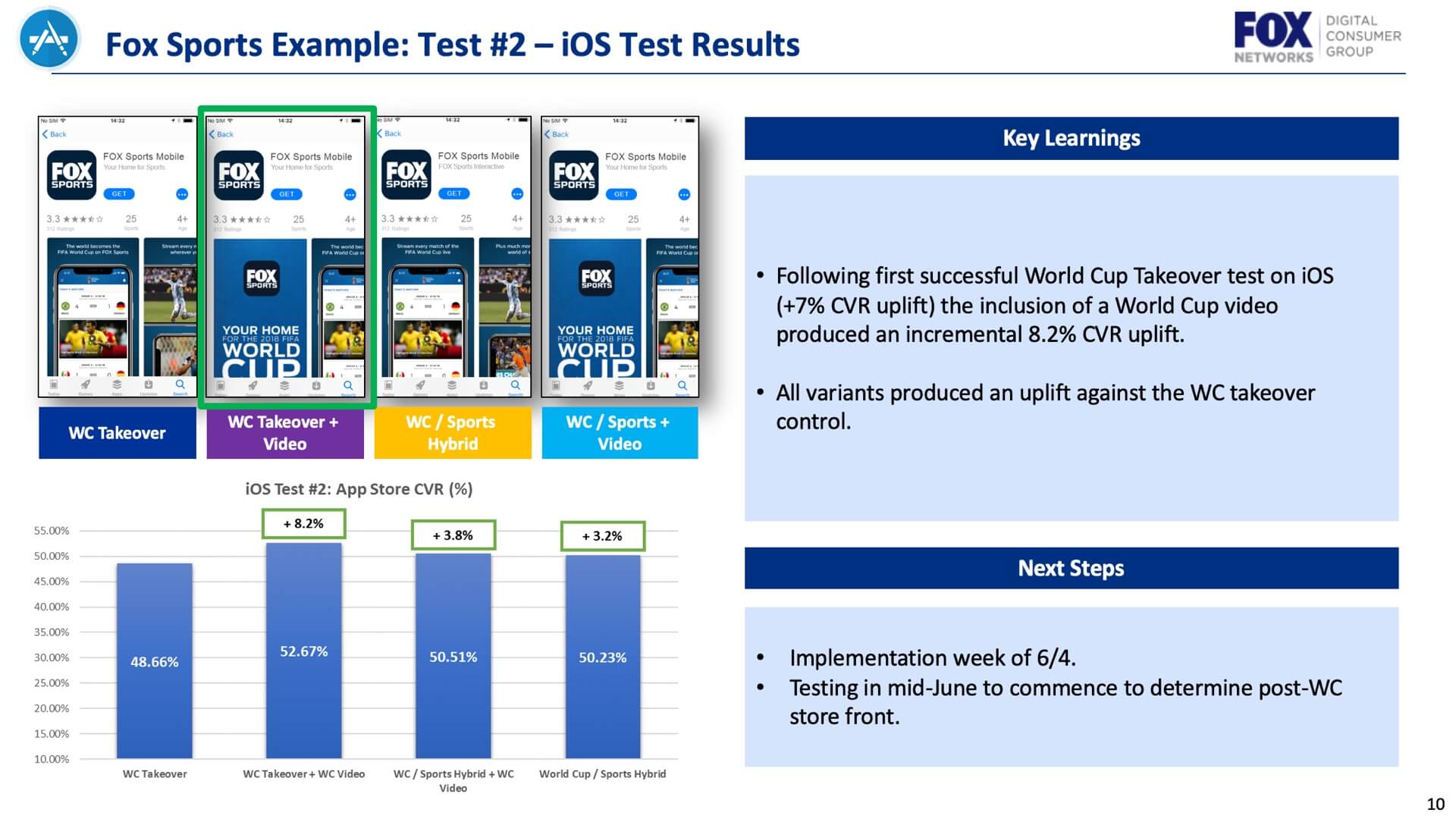
With testing multiple variants of the video we also found the version that displayed live sports action within the first 5 seconds had a 3% higher download rate than a video that displayed features first.
Over the course of the world cup the app was downloaded over a million times, and creating this video along with testing ensured that we were taking good use of this exposure to grab as many users as we could that visited the app store page.
Loading videos were also made to further support our World Cup efforts.
Role
Motion Designer
Primary Collaborators
Wesley Grose - Production Designer
Year
2019
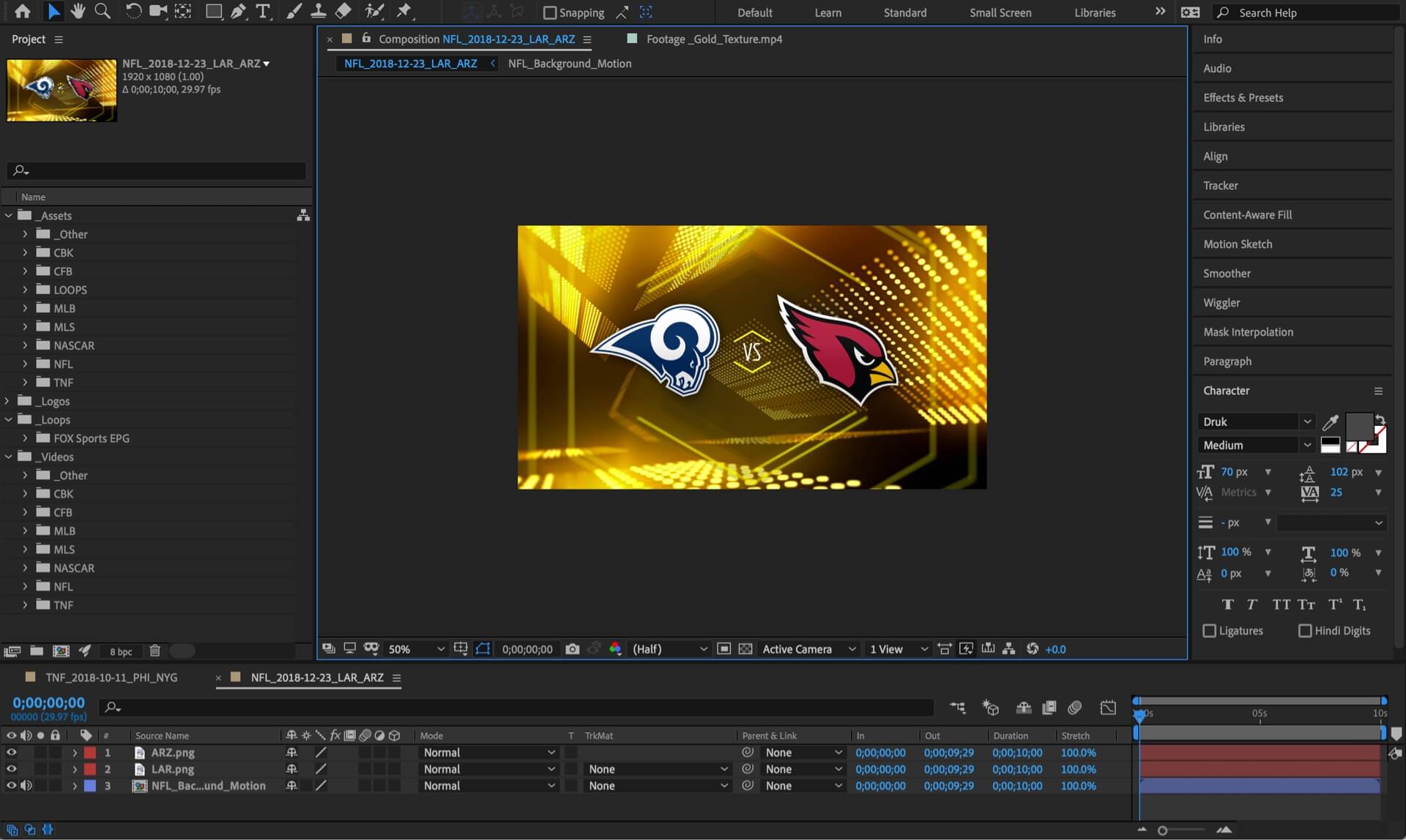
When projects include items that will be created on a weekly basis, it’s important to develop a system that makes them simple and efficient to reproduce. I developed these systems for our FOX loading videos as well as for our sports matchup chips.
To create a bit more dynamic movement within our app, we introduced subtle motion to our sports specific matchup chips. These needed to be designed and created on a weekly basis, and in such a way that a template could be utilized to create them quickly and efficiently.
I created an AE file which already had all the potential logo assets in them, so you would just be finding and replacing a couple logos to create the new videos instead of creating them form scratch each time - and needed no further creative consulting.
Role
Motion Designer
Primary Collaborators
Jon Dean - SVP, Design
Year
2019
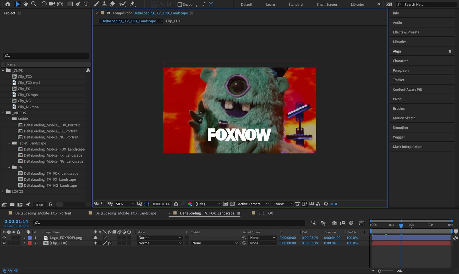
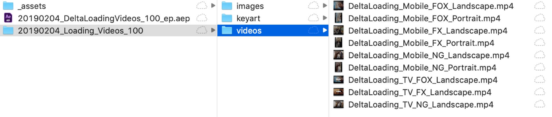
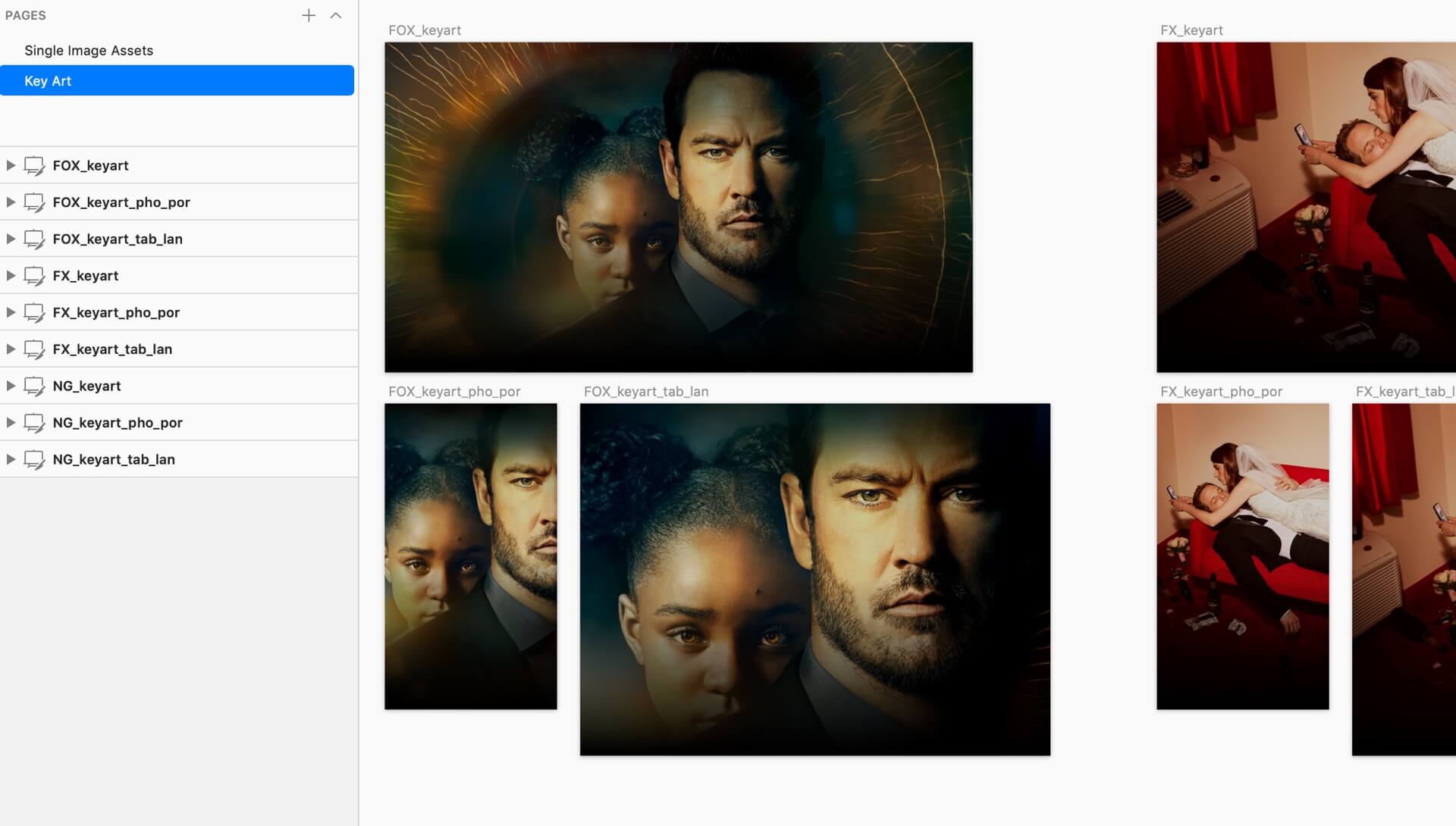
With our app loading videos that feature specific show content that is being promoted that week, it was important to me that we could create a file and folder structure which you could just replace assets, do a short bit of QA, and then ultimately export them out instead of building the videos each and every time. When it came to the loading videos, it cut the amount of time it took to generate the videos in half.
After creating a new folder instance, you would replace the featured video clips and images from a sketch template I created, and each of the videos would be generated out of those assets. Making consistent naming conventions allowed for a user to not have to edit anything in the AE file - all the videos would already be ready to go with the new content automatically. After a little bit of QA for the mobile versions to make sure the crops line up, you can export the videos.

Role
Motion Designer
Primary Collaborators
Jon Dean - SVP, Design
David Feldstein, VP Product
Calvin Kuo, Product
Year
2019
Role
Motion Designer
Primary Collaborators
Henry Escoto - Executive Director, Design
Year
2019
Role
Motion Designer
Primary Collaborators
Jon Dean - SVP, Design
Year
2019